Learning Articles covering Lean Six Sigma, Quality Management, Project Management, Statistics, and Continuous Improvement with DMAIC methodology, Lean tools, PMP certification, data analysis, knowledge sharing, and professional development for engineers, quality professionals, and project managers.

Learning Articles

Value Stream Mapping cover infographic illustrating before and after process improvement, waste reduction, bottleneck elimination, smoother process flow, improved customer value, and key benefits of Lean Value Stream Mapping.

Value Stream Mapping: A Practical Guide to Current State, Future State and Process Improvement

Learn how to create, analyze, and improve Value Stream Maps using current-state and future-state mapping to identify waste, bottlenecks, and ...
What is Kaizen infographic explaining continuous improvement, Kai as change, Zen as good or better, and the PDCA cycle for change for the better.

What is Kaizen? The Science Behind Continuous Improvement

Learn how to implement Kaizen step by step using a practical roadmap, proven tools, and real-world examples to eliminate waste, ...
What is FMEA? Failure Mode and Effects Analysis explained with real examples, RPN calculation, process steps, and free template.

What is FMEA? Failure Mode and Effects Analysis with Examples, RPN Calculation & Free Template

Learn what FMEA (Failure Mode and Effects Analysis) is, how to calculate RPN, identify failure modes, reduce risk, and use ...
Lean Manufacturing myths infographic showing common misconceptions, hidden business costs, continuous improvement, value-focused processes, waste reduction, and customer-focused results.

Lean Manufacturing Myths That Cost Companies Millions (And What Actually Works)

Learn the Lean Manufacturing myths that silently cost companies millions in wasted time, resources, and missed opportunities. Discover what actually ...
Fishbone Diagram example showing cause-and-effect analysis with categories such as Manpower, Machine, Method, Material, Measurement, and Mother Nature

Fishbone Diagram (Ishikawa Diagram): The Root Cause Analysis Tool That Prevents Recurring Problems + Free Excel Template

Learn how the Fishbone Diagram, also known as the Ishikawa or Cause-and-Effect Diagram, helps teams uncover potential root causes, investigate ...
5 Why Root Cause Analysis infographic showing problem investigation steps, repeated why questions, and root cause identification

5 Why Root Cause Analysis: The Simple Way to Find the Real Root Cause of a Problem

Learn how 5 Why Analysis helps identify the real root cause of a problem through a simple, structured questioning technique ...
What is OEE (Overall Equipment Effectiveness) infographic showing OEE calculation using Availability, Performance, and Quality metrics. Manufacturing dashboard with OEE score, OEE calculator, factory automation, industrial productivity, Lean Six Sigma, continuous improvement, equipment performance monitoring, and operational excellence concepts.

OEE (Overall Equipment Effectiveness) — How Much of Your Machine’s True Potential Are You Really Using?

Learn how to calculate OEE (Overall Equipment Effectiveness) using formulas, real-world manufacturing examples, industry benchmarks, and practical improvement strategies. Discover ...
Pugh Matrix example showing concept comparison, evaluation criteria, scoring method and decision making process for selecting the best design alternative

Pugh Matrix (Decision Matrix)? How to Select the Best Design Concept

Learn what a Pugh Matrix (Decision Matrix) is, how to create one, and how it helps compare design concepts and ...
Generative AI vs Lean Six Sigma infographic comparing AI automation and analytics with Lean Six Sigma DMAIC problem solving

Can Generative AI Replace Lean Six Sigma in the Future?

Can Generative AI replace Lean Six Sigma? Discover the key differences, strengths, limitations, and future relationship between AI and Lean ...
Central Limit Theorem (CLT) in Statistics showing population, random samples, sampling distribution of the mean, normal distribution, standard error, and sample mean concept

Central Limit Theorem (CLT): The Foundation of Modern Statistics Behind Six Sigma, Quality Engineering & Data Analysis

Learn the Central Limit Theorem (CLT) with easy-to-understand explanations, formula, conditions, assumptions, solved examples, applications, sampling distribution, and a free ...
Six Sigma infographic showing DMAIC phases, process improvement, data-driven decisions, defect reduction, quality improvement, and business performance results.

What is Six Sigma (6σ)? How World-Class Companies Improve Quality and Save Millions

Learn how world-class companies use Six Sigma to eliminate defects, streamline processes, reduce costs, and achieve near-perfect quality ...
8D Problem Solving Methodology infographic showing eight circular steps, free 8D template, root cause analysis, corrective actions, recurrence prevention, and customer satisfaction improvement.

8D Problem Solving: Complete Guide with Real Engineering Examples and Practical Lessons

Learn what 8D Problem Solving is, how the eight disciplines work, and how organizations use this structured methodology to identify ...
What is Poka-Yoke mistake-proofing system showing error-proof manufacturing process with sensors, fixtures, and quality control

Poka-Yoke: Designing Error-Proof Processes That Prevent Defects

Learn how Poka‑Yoke (Mistake Proofing) helps prevent errors before they occur. Discover practical examples, proven techniques, real-world applications, and best ...
Process Capability Cp and Cpk infographic showing specification limits (LSL and USL), process variation, process centering, defect prediction, quality assurance, manufacturing quality control, and Six Sigma capability analysis.

What is Process Capability (Cp & Cpk)? How World-Class Companies Predict defects before they happen

Why do some processes consistently meet customer requirements while others generate defects and rework? In this practical guide, learn what ...
5S Lean Manufacturing infographic showing Seiri Sort, Seiton Set in Order, Seiso Shine, Seiketsu Standardize, and Shitsuke Sustain for workplace organization and continuous improvement.

What is 5S Lean Manufacturing? Real Examples, Benefits and Implementation Guide

Learn what 5S Lean Manufacturing is, how the five 5S steps work, and how organizations use 5S to reduce waste, ...
Lean vs Six Sigma careers infographic comparing career growth, AI impact, analytics, process improvement, quality management, and job opportunities in the AI era

Lean vs Six Sigma Careers: Which Career Wins in the AI Era?

As AI transforms industries, one question comes up repeatedly: Will Lean or Six Sigma still be a good career choice? ...
Mission vision goals and objectives hierarchy showing how strategic planning elements align to achieve organizational success

Mission, Vision, Goals and Objectives in Strategic Management

Learn the difference between mission, vision, goals, and objectives in strategic management. Explore their hierarchy, practical examples, and how they ...
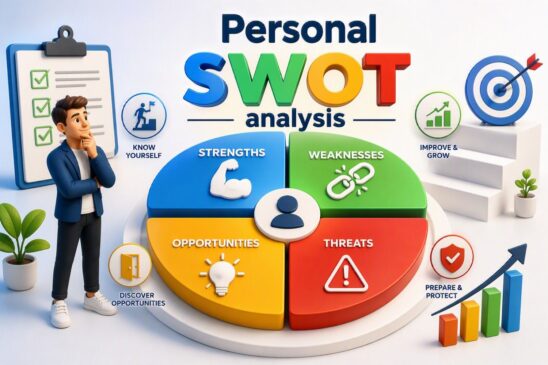
Personal SWOT Analysis framework showing strengths, weaknesses, opportunities and threats used for self-assessment, career development and personal growth planning

Personal SWOT Analysis: Identify Your Strengths, Weaknesses, Opportunities & Threats Using a SWOT Analysis Template

Learn how to conduct a Personal SWOT Analysis with a step-by-step guide, practical examples, and a free SWOT analysis template ...
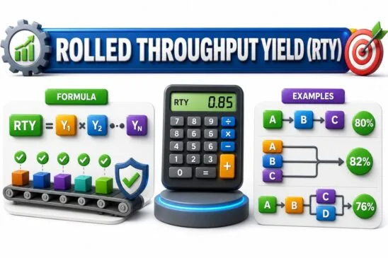
Rolled Throughput Yield (RTY) infographic showing RTY formula, calculator, and process flow examples for series and parallel manufacturing processes

Rolled Throughput Yield (RTY): Formula, Calculator & Examples

Learn how Rolled Throughput Yield (RTY) reveals the true performance of multi-step processes. This comprehensive guide covers the RTY formula, ...
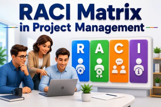
RACI Matrix in project management illustrating responsible, accountable, consulted and informed roles for effective project planning and team collaboration

RACI Matrix in Project Management: How to Create a RACI Matrix and Eliminate Role Confusion

Learn what a RACI Matrix is, how to create one, and how it improves project accountability by defining clear roles, ...
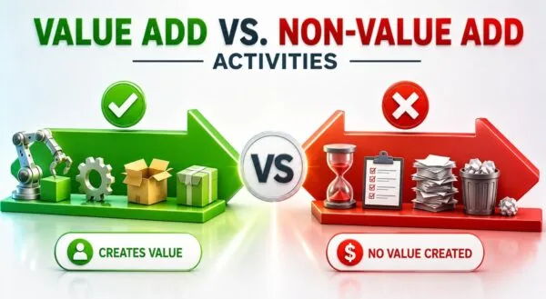
Value Add vs Non-Value Add Activities infographic showing customer value creation versus waste in Lean process improvement

Value Add vs. Non-Value Add Activities: Finding Hidden Waste

Learn how to distinguish value add and non-value add activities, identify hidden waste, and improve process efficiency using practical Lean ...
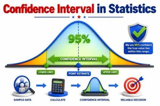
Confidence Interval in Statistics infographic showing 95 percent confidence level, point estimate, lower limit, upper limit, and confidence interval range

What is a Confidence Interval in Statistics? How to Interpret It Correctly (With Real-World Examples & Calculator)

Confidence interval is the range of estimate we are making. Say for e.g we are 95 % confident that True ...
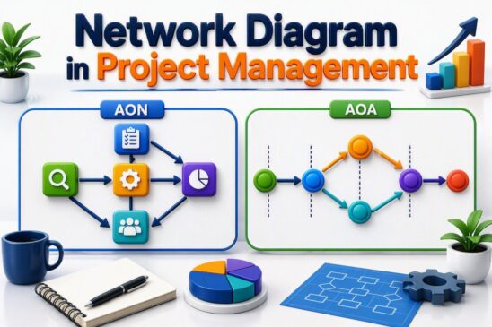
AON vs AOA network diagram types in project management showing activity-on-node and activity-on-arrow scheduling techniques

Network Diagram in Project Management: How to Identify Critical Paths, Avoid Delays, and Eliminate Bottlenecks

Learn how a Network Diagram in Project Management helps identify critical paths, avoid delays, eliminate bottlenecks, and improve project scheduling ...
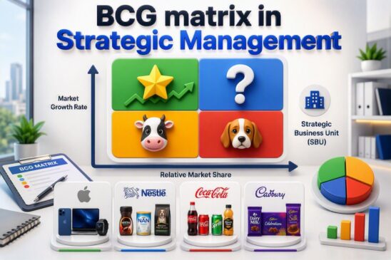
BCG Matrix in strategic management showing Stars, Question Marks, Cash Cows, and Dogs quadrants with examples of strategic business units and market share analysis

BCG Matrix in Strategic Management : How Companies Decide Which Products Become Stars or Cash Cows

Learn the BCG Matrix in Strategic Management with a simple visual guide. Understand the four quadrants—Stars, Cash Cows, Question Marks, ...
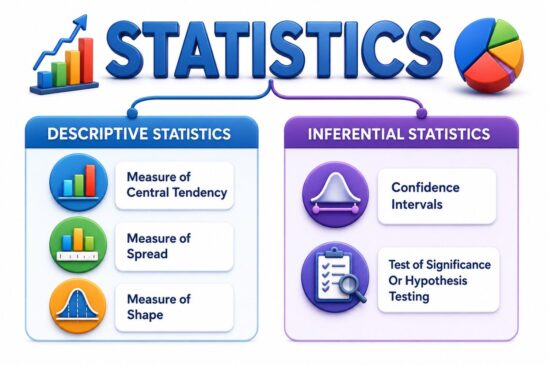
Statistics infographic showing descriptive statistics and inferential statistics with examples such as central tendency, spread, confidence intervals, and hypothesis testing

Statistics is more than Math: Why most people Learn Statistics Wrong

Learn statistics the right way by focusing on concepts before formulas. This beginner-friendly guide uses real-world examples, visuals, and practical ...
DMAIC Six Sigma methodology infographic showing Define, Measure, Analyze, Improve, and Control phases for reducing defects, improving quality, and achieving measurable results.

DMAIC Master Guide: Complete Six Sigma Framework

Learn how to apply DMAIC with real-world projects, free templates, calculators, AI tools, case studies, and expert lessons. This complete ...
Sampling in Statistics infographic showing population vs sample and probability vs non-probability sampling methods

Sampling in Statistics: How to Choose the Right Sampling Method (Probability vs Non-Probability)

Sampling is a statistical technique that allows statistician, researchers to infer about a population based on results generated from Sample ...
8 Wastes of Lean Manufacturing infographic showing defects, overproduction, inventory, waiting, unused talent, transportation, motion, and overprocessing with 3D visual examples for Lean waste reduction.

8 Wastes of Lean Manufacturing: How to Identify and Eliminate Waste

Learn what Lean Manufacturing Waste is and discover the 8 wastes that reduce productivity, increase costs, and impact quality. This ...
PDCA Plan Do Check Act cycle infographic

PDCA Cycle (Plan-Do-Check-Act): How World-Class Manufacturers Improve Quality and Reduce Defects

Learn how the PDCA Cycle (Plan-Do-Check-Act) helps world-class manufacturers improve quality, reduce defects, and drive continuous improvement. This comprehensive guide ...
Quality Function Deployment QFD infographic showing Voice of Customer, House of Quality, technical requirements, and product design process

Quality Function Deployment (QFD) and House of Quality: From Voice of Customer to Product Design

Learn how Quality Function Deployment (QFD) converts customer needs into product design requirements using the House of Quality. Explore practical ...
Scales of Measurement in Statistics infographic showing Nominal, Ordinal, Interval and Ratio scales with visual examples

Scales of Measurement: How to Choose the Right Scale (Nominal, Ordinal, Interval & Ratio)

Learn how Nominal, Ordinal, Interval, and Ratio scales are used in statistics, research, data analysis, and decision-making ...
Kanban board framework showing workflow visualization, work in progress limits, task management and continuous improvement in Agile project management

What is Kanban? How to Create a Kanban Board that Improves Productivity

Learn how Kanban helps teams visualize workflow, limit work in progress, eliminate bottlenecks, and boost productivity using simple yet powerful ...
Scroll to Top