What is Statistics? Understanding Descriptive and Inferential Statistics
In today’s data-driven world, decisions are increasingly influenced by information rather than intuition alone. Businesses analyze customer behavior, healthcare professionals study treatment outcomes, manufacturers monitor process performance, and researchers evaluate trends to better understand complex problems. Behind many of these decisions lies a discipline that helps transform raw data into meaningful insights: Statistics.
Statistics provides a structured way to organize, interpret, and communicate information so that patterns, relationships, and trends become easier to understand. Rather than viewing data as a collection of numbers, statistics helps us convert information into knowledge that can support better decision-making across a wide range of fields.
Whether you’re working in quality management, Six Sigma, engineering, healthcare, finance, research, or data analytics, statistical thinking plays an important role in understanding variation, evaluating performance, and making informed decisions. Developing a solid foundation in statistics not only improves analytical skills but also helps build confidence when working with data in real-world situations.
Why Most People Learn Statistics Wrong
Looking back, I don’t believe most people find statistics difficult—they’re simply introduced to it the wrong way. The first thing many learners see is a page full of formulas, symbols, and probability rules, so it’s easy to assume that statistics is just another branch of mathematics. That often leads to memorizing equations instead of understanding the questions those equations are meant to answer.
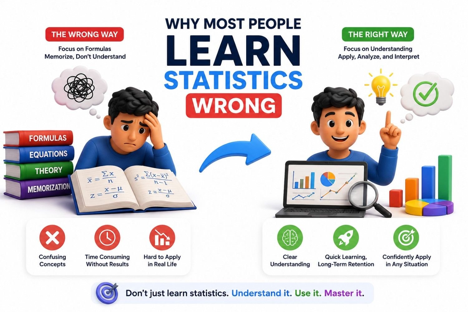
I had the same misconception early in my career. As an engineer, I believed that if I could correctly calculate averages, standard deviations, and confidence intervals, I understood statistics. That changed once I began leading Lean Six Sigma and quality improvement projects. I quickly realized that statistical software could perform the calculations in seconds. The real value came from deciding what data to collect, determining whether the results reflected a genuine improvement or normal variation, and using that evidence to make confident business decisions. That shift completely changed how I view statistics. Today, I see it not as a collection of formulas, but as a practical framework for making better decisions with data—and that’s the perspective I’ll share throughout this guide.
What Statistics Really means in Simple Words
If someone asked me to explain statistics in simple words, I wouldn’t start with formulas or probability. I’d simply say statistics is the science of collecting, organizing, analyzing, and interpreting data so we can make better decisions. Every time we work with exam scores, customer feedback, production measurements, sales figures, or survey results, statistics helps us turn raw data into meaningful insights.
Statistics is a branch of science that transforms raw data into meaningful information. By collecting, organizing, analyzing, and interpreting data, it helps us identify patterns, draw conclusions, and make evidence-based decisions.
I didn’t fully understand this when I first learned statistics. Like many engineers, I thought it was all about calculating averages and standard deviations. That changed when I started leading Lean Six Sigma projects. I realized the calculations were the easy part—software could do those in seconds. The real challenge was understanding what the data was telling us and whether it justified taking action. Since then, I’ve looked at statistics not as a collection of formulas, but as a practical way to separate facts from assumptions and make confident decisions.
Throughout this article, that’s exactly how I’ll explain statistics: not as a difficult mathematical subject, but as a skill that helps you understand data, solve real problems, and make smarter decisions with confidence.
🎓 Top-Rated Courses & Certifications
Try changing your filters or searching for another course.
How Statistics Turns Data into Decisions
I have observed that from leading Lean Six Sigma and quality improvement projects is that data rarely gives you the answer immediately it gives you clues. Early in my career, I assumed statistics was mainly about calculating averages, standard deviations, and creating charts. Over time, I realized those calculations are only useful if they help you make a better decision.
I still remember a project where our team was convinced that a production issue was caused by a machine setting. Instead of making changes based on experience alone, we collected process data and analyzed it. The results surprised us. The machine wasn’t the problem at all—the defects were linked to a variation in raw material received from a specific supplier. On another project, a process appeared to improve after we introduced a change, and everyone was ready to celebrate. But when we looked at the data over a longer period, the improvement turned out to be normal process variation rather than a real breakthrough. In both cases, statistics helped us avoid the wrong decision.
Experiences like these completely changed my perspective. Today, I don’t think of statistics as a collection of formulas—I think of it as a practical decision-making tool. It helps me move beyond opinions, ask better questions, and trust evidence over assumptions. That’s how statistics turns raw data into decisions that actually improve quality, reduce risk, and solve real-world problems.
Two Main Types of Statistics
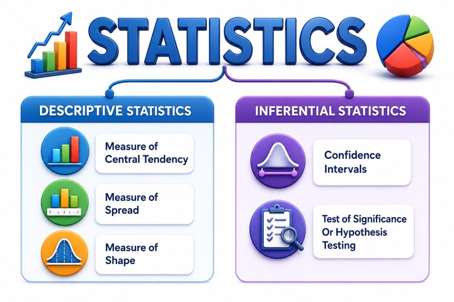
One realization completely changed how I learned statistics: despite the many formulas and techniques, almost everything I use in my work falls into just two types of statistics—descriptive and inferential. Once I understood this, the subject became much less intimidating.
In the Lean Six Sigma projects I’ve led, I always begin with descriptive statistics. Before jumping to conclusions, I summarize the data using simple measures and charts to understand what’s happening. I still remember a project where a basic trend chart revealed that most defects were occurring during one production shift. That insight gave us a clear starting point instead of relying on guesswork.
The next step is deciding whether those findings represent a real issue or are simply due to normal variation. That’s where inferential statistics becomes valuable. It helps me determine whether the evidence is strong enough to support a decision. From my experience, the easiest way to remember the difference is this: descriptive statistics explains your data, while inferential statistics helps you make decisions from it. Once I started thinking this way, learning new statistical tools became much more logical because they almost always fit into one of these two categories.
Descriptive Statistics : Understanding What Happened
From my experience, every successful data analysis starts with descriptive statistics. Before looking for root causes or testing assumptions, I always want to understand what the data is actually saying. Simple tools like the mean, median, range, standard deviation, and charts often reveal insights that aren’t obvious when you’re staring at spreadsheets full of numbers.
I remember working on a quality issue where the team believed defects were occurring randomly across the production line. Instead of jumping to conclusions, we summarized the data and visualized it. Within minutes, a clear pattern appeared—most defects were concentrated during a specific production shift. That simple analysis changed the direction of our investigation and saved us from spending time on the wrong problem.
Experiences like this have taught me that descriptive statistics doesn’t explain why something happened—it helps you understand what happened. Once you have that foundation, you’re in a much better position to ask the right questions, investigate the real causes, and make decisions based on evidence instead of assumptions.
Measures used in Descriptive Statistics
Once descriptive statistics helps us answer the question “What happened?”, the next step is understanding how it does that. This is where various descriptive statistical measures come into play. Think of these measures as different lenses for looking at the same dataset
- Measure of Central Tendency
- Measure of Spread
- Measure of Shape
Measure of Central Tendency
One of the first concepts I explain to anyone learning statistics is central tendency because it answers a simple but important question: “What is the typical value in this dataset?” Instead of examining every individual observation, a measure of central tendency summarizes the entire dataset with a single representative value. This makes it much easier to understand and compare data.
In descriptive statistics, measures of central tendency—also called measures of location—identify the center of a dataset. The three most common measures are Mean, Median, and Mode. Each describes the “middle” of the data in a different way, and the most appropriate measure depends on the type and distribution of the data. Throughout my quality engineering and Lean Six Sigma projects, these measures have always been my starting point because they provide a quick snapshot of process performance before moving on to more detailed analysis.
Click this YouTube video link for detailed understanding.
Mean
The mean, commonly known as the average, is the most widely used measure of central tendency. It is calculated by adding all the values in a dataset and dividing the total by the number of observations. The result represents the central or typical value of the data.
The mean is useful because it includes every value in the dataset. But it can be affected strongly by unusually high or low values. Say for examples we have n values of data having individual values as A1, A2, A3….An . Then mean or arithmetic mean is calculated as A1+ A2+ A3+….An/ n.
Assume the following data set : 10,20,30,20,40,20,10
Sum = 10+20+30+20+40+20+10 = 150 ; N= 7
Mean = 150/7 = 21.42
The mean of these data is 21.42
Median
The median is the middle value when the data is arranged in ascending or descending order. If there is an odd number of values, the median is the middle one. If there is an even number of values, the median is the average of the two middle values. The median is especially useful when data is skewed or contains extreme values. First thing , we need to arrange the data in ascending order.
– If number of value is ODD, then the median is the middle value when arranged in ascending order.
– Is number of value is EVEN, the median is the average of two middle value when arranged in ascending order.
Assume the following data set : 10,20,30,25,40,35,10
Arranging in ascending order : 10, 10, 20, 25, 30, 35, 40
Median is 25 (Since number of value is “Odd”)
Lets take another example when data set is “Even”
Assume the following data set : 10,20,30,25,40,35,10, 20
Arranging in ascending order : 10, 10, 20, 20, 25, 30, 35, 40
Median is 20+25/2= 22.5 (Since number of value is “Even”)
Mode
The mode is the most frequently occurring value. In some datasets there is one mode, in others there may be more than one, and sometimes there is no repeated value at all. The mode is especially useful for categorical data, such as favorite subject, preferred mobile brand, or most common blood group. Most frequent occurring value in a set of data values
Assume the following data set : 10, 20, 30, 20, 40, 20,10
Most frequent occurring value =20
Measures of Dispersion
Knowing the center of the data is helpful, but it is not enough. Two datasets can have the same average and still be very different. That is why descriptive statistics also uses measures of dispersion, sometimes called measures of spread or variability. Measure of Spread is also known by another name “Measure of Dispersion“. It defines how the data is spread or scattered.
Assume the following data set : 49, 50, 58, 58, 60, 62, 66, 68, 70, 72
•Average = 61.3
•Range: R = max – min. = > = 72- 49 = 23
Variance and standard deviation provide a deeper view. Variance measures how far values tend to lie from the mean. Standard deviation is the square root of variance and is often easier to interpret because it is in the same unit as the data.
Variance
The standard deviation is simply the positive square root of the variance.
Standard Deviation
The standard deviation is simply the positive square root of the variance. A lower standard deviation means values are clustered close to the average. A higher standard deviation means values are more spread out.
Interquartile Range :
Often called IQR, is another useful measure. It focuses on the middle 50 percent of the data and is less sensitive to extreme values. The formula is:
IQR = Q3 – Q1
where Q1 is the first quartile and Q3 is the third quartile.
Measures of Shape
Measures of shape describe how the data is distributed. Measure of Shape is further categorized in to two types : Symmetry and Modality
Skewness
Skewness measures the asymmetry of a dataset or probability distribution. A skewness value of 0 indicates a perfectly symmetric distribution. If the distribution has a longer tail on the right, it is called positively skewed (right-skewed). If the longer tail is on the left, it is called negatively skewed (left-skewed). Although skewness can theoretically take any value, values close to 0 indicate a nearly symmetric distribution, while larger positive or negative values indicate greater asymmetry.
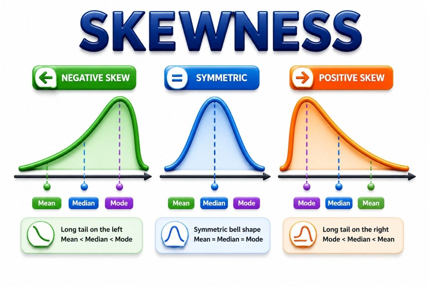
- Skewness = 0 → Perfectly symmetric distribution
- Skewness > 0 → Positive (right) skew
- Skewness < 0 → Negative (left) skew
- Between -0.5 and +0.5 → Approximately symmetric
- Between ±0.5 and ±1.0 → Moderately skewed
- Greater than ±1.0 → Highly skewed
Kurtosis
Kurtosis describes the overall shape of a distribution by showing whether the data has heavier or lighter tails compared to a normal distribution. In simple terms, it indicates how likely the dataset is to contain extreme values or outliers. Under Pearson’s definition, a normal distribution has a kurtosis value of 3. Based on this measure, distributions are classified into three types: Mesokurtic (normal), Leptokurtic (heavier tails), and Platykurtic (lighter tails).

- Leptokurtic (Kurtosis > 3) → Heavy tails and a higher likelihood of outliers.
- Mesokurtic (Kurtosis = 3) → Similar to a normal distribution.
- Platykurtic (Kurtosis < 3) → Light tails and fewer extreme values.
Modality
Modality describes the number of peaks (modes) in a data distribution. It helps identify how many distinct groups or clusters are present in the data. A distribution with one peak is called Unimodal, two peaks is called Bimodal, and three or more peaks is called Multimodal.
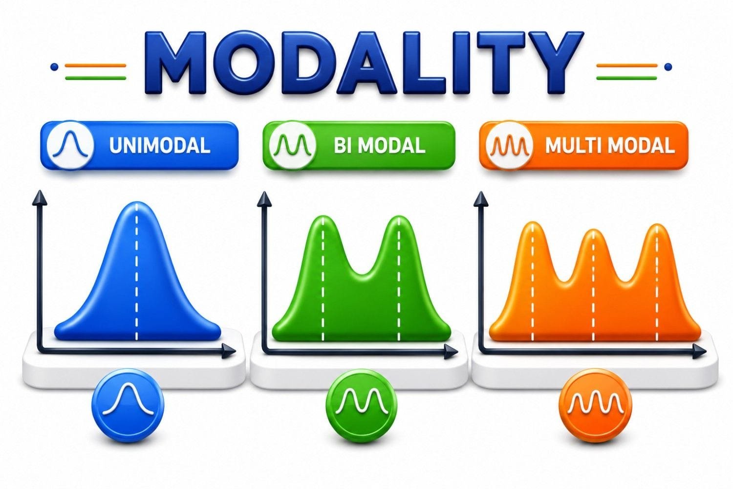
Understanding modality helps determine whether the data comes from a single population or multiple underlying groups, making it an important tool for exploring and interpreting datasets.
📚 Recommended Books for Professionals
Try removing one or more filters.
Inferential Statistics: Making Decisions Beyond the Data
If descriptive statistics helps us understand what happened, inferential statistics helps us answer a much bigger question:
"What can we conclude beyond the data we currently have?"
This is where statistics becomes truly powerful. In the real world, we rarely have access to every piece of information we would like. A company cannot survey every customer. A hospital cannot study every patient. A manufacturer cannot inspect every product. Instead, we collect a sample and use it to make informed decisions about the larger population. This process is known as inferential statistics.
In simple terms, inferential statistics uses sample data to make estimates, predictions, and decisions about a larger population. Rather than merely describing what we observed, it helps us determine what is likely to be true beyond the data in front of us. This ability to move from observation to decision-making is what separates inferential statistics from descriptive statistics.
I first realized the importance of inferential statistics during a Lean Six Sigma project focused on reducing defects in a manufacturing process. After implementing several improvements, the team was excited because the defect rate appeared lower than before. Looking at the raw numbers alone, it seemed obvious that the project had succeeded. However, experience taught me to ask a different question:
"Did the process truly improve, or are we simply observing normal variation?"
Descriptive statistics could tell us that the defect rate decreased. Inferential statistics helped us determine whether that decrease was statistically significant and likely to continue in the future. By analyzing confidence intervals and performing hypothesis testing, we were able to conclude that the improvement was real and not just a temporary fluctuation. That decision ultimately influenced how the process was standardized across the facility.
- Confidence Intervals ( YouTube video link)
- Test of Significance Or Hypothesis Testing
How Inferential Statistics Works
One of the biggest differences between descriptive and inferential statistics is that descriptive statistics focuses on the data you already have, while inferential statistics helps you make decisions about data you do not have. At first, this might sound impossible. How can we draw conclusions about an entire population when we only have information from a sample? The answer lies in understanding that a well-chosen sample often contains enough information to help us make reliable predictions about the larger group it represents.
Think about how opinions are measured before an election. Polling organizations do not ask every voter for their opinion. Instead, they collect responses from a carefully selected sample and use inferential statistics to estimate what the broader population is likely to think. The same principle applies in business, healthcare, manufacturing, quality improvement, and scientific research. Since collecting data from every individual, product, or customer is often impractical, inferential statistics provides a practical alternative.
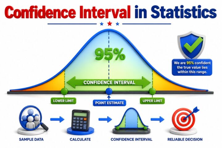
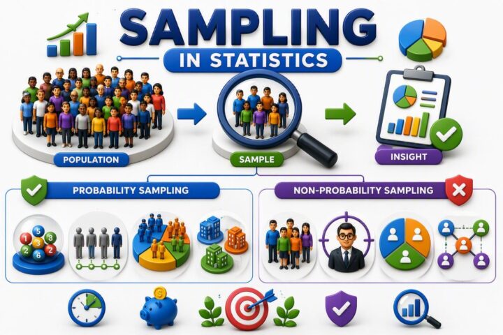
The process typically begins with a population, which represents the entire group we are interested in studying. Since examining the whole population is often difficult, we collect a sample, which is a smaller subset of that population. Naturally, no sample is a perfect reflection of the population, which means some uncertainty will always exist. This difference between a sample result and the true population value is known as sampling error.
The process typically begins with a population, which represents the entire group we are interested in studying. Since examining the whole population is often difficult, we collect a sample, which is a smaller subset of that population. Naturally, no sample is a perfect reflection of the population, which means some uncertainty will always exist. This difference between a sample result and the true population value is known as sampling error.
I remember a Lean Six Sigma project where a process change appeared to improve production efficiency. The average cycle time decreased, and everyone wanted to declare the project successful. However, experience taught me that averages alone can be misleading. By applying hypothesis testing, we confirmed that the improvement was statistically significant and unlikely to have occurred by chance. This additional analysis gave management the confidence to implement the changes across multiple production lines.
Descriptive vs Inferential Statistics: The Key Difference
I used to mix up descriptive and inferential statistics because both involve working with data. After applying them in real Lean Six Sigma projects, the difference became much clearer. Descriptive statistics helps me understand what the data shows today by summarizing it with averages, charts, and measures of variation. It's the first step I take whenever I'm trying to understand a process.
Inferential statistics, on the other hand, helps me answer a much bigger question: "Can I use this sample to make a decision about the entire population?" I rely on it when I need to determine whether an observed improvement is genuine or simply the result of random variation. More than once, I've seen teams ready to implement a process change based on a handful of promising results, only for statistical testing to show that the improvement wasn't yet convincing.
The easiest way I remember the difference is this: descriptive statistics summarizes the data you have, while inferential statistics helps you make decisions beyond that data. One explains what happened; the other helps predict what is likely true. In practice, I rarely use one without the other. I first understand the data with descriptive statistics, then use inferential statistics to decide whether I have enough evidence to take action.
Why Statistics is not just about getting the Right Answer
I've learned after years of working on Lean Six Sigma and quality improvement projects is that statistics isn't about getting the "right" answer—it's about making the right decision. Early in my career, I believed every analysis would produce a clear conclusion. In reality, data rarely speaks that confidently. It often tells you how certain—or uncertain—you should be before taking action.
I still remember a project where a process change appeared to reduce defects. At first glance, the numbers looked great, and the team was ready to roll out the solution across the plant. Instead of relying on the average alone, we analyzed the data more carefully. The improvement wasn't statistically convincing, so we decided to collect more data before making a costly decision. A few weeks later, the apparent improvement disappeared. That experience changed the way I think about statistics forever.
Today, I don't use statistics to prove that I'm right. I use it to challenge assumptions, measure uncertainty, and make decisions based on evidence rather than opinions. Sometimes the analysis confirms your idea, sometimes it doesn't, and sometimes it tells you that you simply don't have enough information yet. In my experience, knowing when not to make a decision is just as valuable as knowing when to act. That's the real power of statistics.

Lean Six Sigma • Six Sigma • Statistics • Project Management • Artificial Intelligence (AI) • Operations Management • Quality Management
Frequently Asked Questions (FAQs)
When should you use descriptive statistics?
Use it when you want to organize and summarize your data without making generalizations.
When should you use inferential statistics?
Use it when you need to make decisions, predictions, or test hypotheses about a population
Does descriptive statistics involve probability?
No—it focuses only on describing the dataset without using probability for predictions
Does inferential statistics use probability?
Yes—it relies on probability to estimate population parameters and test hypotheses.
What are common tools in descriptive statistics?
Mean, median, mode, standard deviation, and data visualization tools like charts and graphs.
What are common tools in inferential statistics?
Hypothesis testing, confidence intervals, regression analysis, and ANOVA
Can descriptive statistics make predictions?
No—it only summarizes the data and does not predict future outcomes.
Can inferential statistics work with small samples?
Yes—but accuracy depends on how well the sample represents the population.
What is a real-world example of descriptive statistics?
Calculating average sales or displaying monthly data in charts to understand trends.
What is a real-world example of inferential statistics?
Using a survey sample to estimate customer preferences for an entire market.
How do descriptive and inferential statistics work together?
Descriptive statistics summarize data first, and inferential statistics extend those insights to a population.
Why are both types important in data analysis?
Together, they help understand data clearly and make informed, evidence-based decisions
Can descriptive statistics handle large datasets?
Yes—it simplifies large datasets into meaningful summaries like averages and charts.
Why is inferential statistics useful in research?
It allows researchers to make conclusions without studying the entire population.
What type of data does descriptive statistics use?
It uses complete or available data to describe its key characteristics.
What type of data does inferential statistics use?
It works mainly with sample data to represent a larger population.
Does descriptive statistics involve hypothesis testing?
No—it does not test hypotheses; it only reports and summarizes data.
Does inferential statistics involve hypothesis testing?
Yes—it uses hypothesis testing to validate assumptions about populations.
Which is easier to understand: descriptive or inferential statistics?
Descriptive statistics is generally easier because it focuses on simple summaries.
Why should both descriptive and inferential statistics be used together?
Descriptive statistics helps understand data, while inferential statistics helps make decisions from it.
Conclusion: Statistics Is a Way of Thinking, Not Just a Subject
If my years in Lean Six Sigma and quality engineering have taught me one thing, it's this: statistics isn't about becoming good at math—it's about becoming better at making decisions. Early in my career, I spent far too much time worrying about formulas. Once I started solving real manufacturing problems, I realized that the biggest challenge wasn't calculating numbers; it was interpreting them correctly and deciding what action to take.
Today, I use statistics as a way to question assumptions, validate ideas, and make decisions backed by evidence instead of opinions. Sometimes the data confirms what I expected, and sometimes it completely changes my perspective. That's exactly why I trust it.
If you're just starting your statistics journey, don't focus on memorizing every formula. Focus on understanding how to think with data. Once you develop that mindset, statistics stops feeling like an academic subject and becomes a practical skill you'll use throughout your career, business, and everyday life. In my experience, that's when statistics truly starts to make sense.
Continue Your Learning Journey
Learning is a continuous process. Explore related topics, practical guides, tools, calculators, templates, and learning resources to expand your knowledge and develop new skills.
Choose a category below to explore practical tutorials, tools, calculators, templates, case studies, and learning resources.
Recommended Learning Resources
Expert-led courses to build practical skills, earn credentials, and advance your career.
Recommended professional books, certification guides, and practical study resources.
Ready-to-use templates, checklists, guides, and workbooks for practical applications.
Interactive calculators for statistics, quality, engineering, analysis, and decision-making.
Interactive Z, t, Chi-Square, and F tables with critical values and distribution curves.
Discover practical tutorials, case studies, and professional resources across Quality, Lean Six Sigma, Project Management, Statistics, AI, and Data Analytics.
Published: July 10, 2021
Last Updated: September 18, 2026