
What is Fishbone Diagram (Ishikawa Diagram or Cause-and-Effect Diagram ?: The Root Cause Analysis Tool That Prevents Recurring Problems + Free Excel Template
When the same problem keeps coming back, fixing the symptom is rarely enough. A Fishbone Diagram, also known as an Ishikawa Diagram or Cause-and-Effect Diagram, helps teams systematically explore the possible causes behind a problem before deciding on a solution.
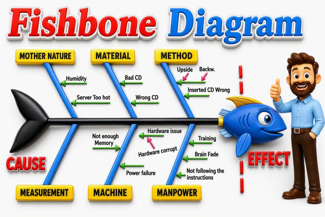
Instead of jumping to conclusions, the Fishbone Diagram encourages structured thinking by organizing potential causes into logical categories. This makes it easier to uncover hidden factors, identify the true root cause, and develop corrective actions that prevent the problem from recurring. Because of its simplicity and effectiveness, the Fishbone Diagram remains one of the most widely used root cause analysis tools in Quality Management, Lean Manufacturing, Six Sigma, and Continuous Improvement initiatives.
This guide explains how the Fishbone Diagram works, when to use it, practical examples, common categories, and includes a free Excel template to help you get started quickly.
What is a Fishbone Diagram?
A Fishbone Diagram, also called an Ishikawa Diagram or Cause-and-Effect Diagram, is a visual tool I use to organize the possible causes behind a problem before deciding on a solution. The problem is placed at the “head” of the fish, while potential causes branch out from the main spine. This simple structure helps a team look beyond the most obvious explanation and consider how different factors may be contributing to the same issue.
In my experience with quality and process improvement, one of the biggest benefits is the change in conversation it creates. Instead of immediately asking, “How do we fix it?”, the team starts asking, “What could be causing it?” That distinction matters. A problem that initially appears to be related to an operator, machine, or process can have contributing factors somewhere else.
I also consider an important limitation: a Fishbone Diagram does not prove the root cause. It helps generate and organize potential causes; those causes still need to be investigated and supported by data or other evidence. Used this way, the Fishbone Diagram becomes a practical starting point for root cause analysis rather than just a brainstorming exercise.
That is why I find it particularly useful when a team is dealing with a recurring problem. Instead of repeatedly correcting the symptom, the discussion can move toward understanding the conditions that allowed the problem to occur—and ultimately toward corrective action that addresses the cause.
History of the Fishbone Diagram and Dr. Kaoru Ishikawa
The Fishbone Diagram grew out of Japan’s post-war quality movement and is closely associated with Dr. Kaoru Ishikawa (1915–1989), a Japanese quality expert and professor at the University of Tokyo. Ishikawa believed that solving quality problems should involve the people who understood the process—not just specialists or managers. He was also a major contributor to the development of Quality Circles and company-wide quality improvement.
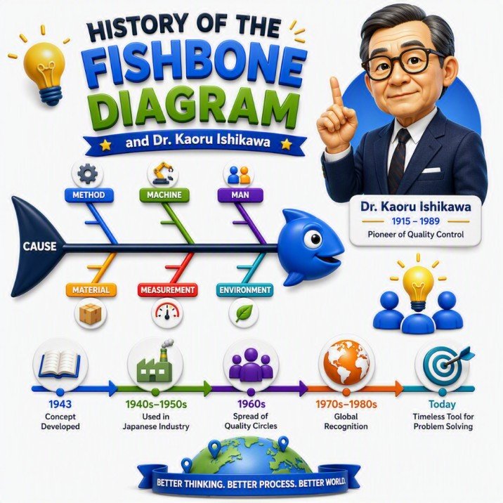
The history of the diagram is sometimes presented with a single invention date, but the story is more nuanced. Ishikawa described developing the cause-and-effect approach around 1950–1951 and applying it at the Fukiai Plant of Kawasaki Steel in 1952. Its distinctive structure eventually earned it the name Fishbone Diagram, while Ishikawa Diagram became another common name for the tool.
What I find most valuable about Ishikawa’s thinking is that the diagram was never meant to be just a brainstorming exercise. Its purpose was to bring people together, make potential causes visible, and create a starting point for investigation. That philosophy still works remarkably well.
In my own quality problem-solving experience, I have seen how quickly a discussion can become focused on “who made the mistake?” A Fishbone Diagram helps redirect that conversation toward “what allowed the problem to happen?” That small change in perspective can uncover process, equipment, material, measurement, or method-related factors that are easy to miss when the focus is on an individual.
More than a visual shaped like a fish, the Fishbone Diagram reflects Ishikawa’s broader philosophy: understand the causes before deciding what to fix. That is the reason I believe this simple tool has remained relevant long after its origins in Japanese manufacturing.
🎓 Top-Rated Courses & Certifications
Try changing your filters or searching for another course.
Why Use a Fishbone Diagram for Root Cause Analysis?
When a problem keeps returning, I try not to jump straight to a solution. I first ask, “What are we missing?” A Fishbone Diagram helps me step back and look at the problem from different angles before deciding what to fix.
In quality investigations, the first explanation is not always the real one. What looks like an operator error may actually involve a work instruction, machine setting, material variation, measurement issue, or process condition. Mapping these possibilities together helps the team avoid locking onto the first assumption.
I also find the tool valuable because it brings different perspectives into the same discussion. The operator may understand what happens on the shop floor, while an engineer or quality professional may see other contributing factors. That combination can reveal things that are easy to miss when investigating alone.
One point I always emphasize: a Fishbone Diagram identifies possible causes—it does not prove the root cause. Those causes still need to be verified using data, observation, testing, or other appropriate analysis.
For me, that is the real value of the Fishbone Diagram: it slows down the rush to a solution and helps the team investigate the problem before trying to fix it.
Fishbone Diagram: The Basic Structure
When I build a Fishbone Diagram, I start with one rule: keep the problem clear and the structure simple. The diagram is meant to help the team think, not make the analysis look complicated. The problem or effect sits at the head of the fish. This is the issue we are trying to understand, so I make it as specific and measurable as possible. “High product defect rate” is much more useful than simply writing “quality problem.”
The main spine connects the problem to the possible causes. From this spine, the major cause categories branch out. In manufacturing, I commonly use the familiar 6M categories: People, Machine, Method, Material, Measurement, and Environment. These categories can be adapted when they do not fit the process being investigated. Next come the potential causes. For example, under Machine, the team might identify equipment wear, maintenance issues, or incorrect settings. Under Method, it could be an unclear instruction or an inconsistent process step.
When a cause needs more investigation, I add sub-causes and keep asking why. This is often where a discussion moves beyond the obvious explanation and starts revealing factors worth investigating. One point is important: everything on the Fishbone Diagram is a potential cause until it is verified. I don’t treat a cause as the root cause simply because it appears on the diagram. Data, observation, testing, or other evidence must support it.
So, in practice, the structure is straightforward: Problem → Cause Categories → Potential Causes → Sub-Causes → Verification
That simple flow is what makes the Fishbone Diagram useful. It gives the team a clear visual path from “Here is the problem” to “Here are the factors we need to investigate.”
6Ms of a Fishbone Diagram
When I start a Fishbone analysis, the 6Ms give me a practical way to make sure we are not looking at the problem from only one angle. They are not six boxes that must be filled in—they are prompts that help the team ask, “What else could be contributing to this problem?”

1. Man – People : This covers factors such as training, experience, communication, workload, staffing, and human error. I avoid treating a mistake as the root cause immediately. Instead, I ask what conditions made that mistake possible.
2. Machine – Equipment: This looks at machines, tools, equipment settings, maintenance, wear, and calibration. A recurring defect that appears to be operator-related can sometimes be traced to equipment variation or an overlooked maintenance issue.
3. Method – Process: Method covers procedures, work instructions, process steps, and standardization. In my experience, a capable person can still produce inconsistent results when the process itself is unclear or poorly designed.
4. Material – Inputs: This includes raw materials, components, consumables, and other process inputs. I always consider material variation because the source of a defect is not necessarily where the defect is discovered.
5. Measurement – Data: Measurement covers inspection methods, gauges, calibration, sampling, and the data used to evaluate the process. If the measurement is unreliable, the entire investigation can head in the wrong direction.
6. Mother Nature – Environment: This refers to environmental conditions such as temperature, humidity, cleanliness, lighting, vibration, or other conditions surrounding the process. In some organizations, this category is simply called Environment.
Why the 6Ms Matters
The real value of the 6Ms is that they broaden the investigation before the team settles on an explanation. I have found that problems often become easier to understand when people stop asking, “Who caused it?” and start looking at the interaction between people, equipment, methods, materials, measurements, and the environment.
One final point is important: a cause listed under any of the 6Ms is only a potential cause until it is verified. The Fishbone Diagram organizes the investigation; evidence determines the root cause.
📚 Recommended Books for Professionals
Try removing one or more filters.
How to Create a Fishbone Diagram: Step-by-Step
Every Fishbone Diagram starts with a well-defined problem statement. Creating a Fishbone Diagram is simple. The difficult part is resisting the urge to jump to a solution before understanding the problem. In my experience, a disciplined approach produces much better results.
Step 1: Define the Problem
Start with a specific, measurable problem statement and place it at the head of the fish. Instead of “poor quality,” write something like:
“Final inspection rejection increased from 2% to 7% over the last four weeks.” A precise problem keeps everyone investigating the same issue.
A clear problem statement keeps the team focused and prevents discussions from drifting into unrelated areas. Whenever I facilitate problem-solving sessions, I spend extra time refining the problem statement because an unclear problem almost always leads to an unclear solution.
Step 2: Choose the Cause Categories:
Next, create the basic Fishbone Diagram. Write the problem statement at the far right side of the diagram, which becomes the "head" of the fish. Draw a horizontal line extending from the problem statement to create the main spine. This spine will serve as the foundation for organizing all potential causes.
At this stage, do not worry about identifying causes yet. Focus only on building the visual structure that will guide the analysis. Add the major branches that make sense for the process. For manufacturing, the 6Ms—Men, Machine, Method, Material, Measurement, and Mother Nature (Environment) are useful starting point. I don't force the 6Ms into every investigation. The categories should fit the problem.
Step 3: Brainstorm Potential Causes:
Bring together people who understand the process and ask: “What could be causing this problem?”
Capture realistic possibilities under the appropriate branches. At this stage, I avoid judging each idea too quickly. The purpose is to make the possibilities visible.
Step 4: Drill Down:
For significant causes, keep asking “Why?” to move beyond the obvious explanation. For example: Defect → Incorrect setting → Setting changes during setup → No standardized setup verification
The goal isn't to ask “Why?” five times simply because a method says so. Stop when the cause becomes specific enough to investigate.
Step 5: Challenge the Diagram:
Before drawing conclusions, review it with the team. Ask: Have we missed anything? Are we relying on assumptions? Are we focusing too heavily on one category? This review can uncover gaps that are easy to miss during the initial brainstorming.
Step 6: Verify the Causes:
This is where a Fishbone Diagram becomes root cause analysis rather than just brainstorming. The causes on the diagram are hypotheses. I verify important ones using data, observation, records, testing, or other appropriate evidence.
Step 7: Correct and Confirm:
Once the contributing causes are verified, develop corrective actions that address them directly. Then monitor the process to confirm that the problem has actually been reduced or eliminated.
A completed Fishbone Diagram is not the end of the investigation. The real measure of success is whether the problem stays solved.
The Simple Flow
Define → Categorize → Brainstorm → Drill Down → Review → Verify → Correct → Confirm
That is the approach I find most useful because it turns the Fishbone Diagram from a brainstorming exercise into a practical roadmap for solving the problem and preventing recurrence.
Best Practices for effective Fishbone Diagram Analysis
Creating a Fishbone Diagram is easy. Creating one that leads to the right investigation takes more thought. In my quality problem-solving work, I have found that the best results come from a few simple habits.
Start With a Clear Problem: A vague problem produces a vague analysis. Instead of “quality issue,” define exactly what is happening, where, and when. Example: “Final inspection rejection increased from 2% to 7% over the last four weeks.”
I usually spend a little extra time getting this statement right because it keeps the entire discussion focused.
Involve the People Closest to the Process: I prefer a small cross-functional team rather than having one person build the diagram alone. Operators, engineers, quality, maintenance, and process owners can each see different parts of the same problem. Some of the most useful causes are often identified by the people who work with the process every day.
Treat Causes as Hypotheses: A cause written on the Fishbone is not a proven root cause. During brainstorming, I capture plausible possibilities first and then challenge them with evidence. This distinction is important. Without it, a team can spend considerable time building corrective actions around an assumption.
Look Beyond Blame: If the discussion stops at “the operator made a mistake,” I ask a different question:
“What allowed the mistake to happen?”
The answer may involve the method, equipment, training, workload, measurement system, or environment. Looking at the conditions around an error usually produces a more useful investigation than simply identifying who made it.
Go Deeper When Necessary : The first explanation is rarely the complete story. For important causes, keep asking “Why?” until the cause becomes specific enough to investigate. The goal is not to ask five Whys because it is a rule. The goal is to get past the symptom and reach something that can be verified and acted upon.
Let Evidence Decide This is probably the most important practice. Use data, records, observation, testing, audits, or other appropriate evidence to determine which potential causes actually contribute to the problem.
A Fishbone Diagram organizes the thinking; evidence confirms the cause.
Keep It Focused: A huge Fishbone Diagram is not necessarily a better one. If every imaginable possibility is added, the important causes can get buried. I prefer to keep the analysis focused on causes that are credible, relevant, and worth investigating.
Close the Loop: Finding a likely cause is only part of the job. After corrective action is implemented, monitor the process to confirm that the problem has actually improved and does not return.
My Rule of Thumb
Define the problem clearly. Involve the right people. Challenge assumptions. Verify the causes. Then confirm the fix. That is what turns a Fishbone Diagram from a brainstorming exercise into a practical root cause analysis tool.

Lean Six Sigma • Six Sigma • Statistics • Project Management • Artificial Intelligence (AI) • Operations Management • Quality Management
Fishbone Diagram Template
📥 Download the FREE Fishbone Diagram (Ishikawa Diagram) Excel Template to identify potential causes, organize root cause analysis, categorize issues using the 6Ms, and uncover the factors contributing to recurring problems.
If you're building a complete Problem Solving Tools toolkit, 5W1H works exceptionally well alongside other proven methodologies. Techniques such as 5 Whys Root Cause Analysis, Fishbone (Ishikawa), 8D Problem Solving, and the PDCA Cycle can help teams dig deeper into causes, implement effective corrective actions, and sustain long-term improvements. I've covered each of these tools in detail in separate articles on my blog.
Frequently Asked Questions (FAQs)
Q. What is a Fishbone Diagram?
A Fishbone Diagram is a visual tool used to identify and analyze the possible causes of a problem.
Q. Why is it called an Ishikawa Diagram?
It is named after Dr. Kaoru Ishikawa, who developed the method for quality improvement and root cause analysis.
Q. What is the purpose of a Fishbone Diagram?
Its purpose is to identify the root causes of a problem so that effective corrective actions can be taken.
Q. What are the 6Ms of a Fishbone Diagram?
The 6Ms are Man, Machine, Method, Material, Measurement, and Mother Nature (Environment).
Q. When should a Fishbone Diagram be used?
It should be used when investigating defects, delays, customer complaints, process failures, or recurring problems.
Q. What is the difference between a Fishbone Diagram and the 5 Whys?
A Fishbone Diagram explores multiple possible causes, while the 5 Whys investigates one cause in greater depth.
Q. Is a Fishbone Diagram a Root Cause Analysis (RCA) tool?
Yes. It is one of the most widely used tools for Root Cause Analysis.
Q. Can Fishbone Diagrams be used outside manufacturing?
Yes. They are commonly used in healthcare, IT, project management, education, and service industries.
Q. What are the advantages of a Fishbone Diagram?
It promotes structured thinking, team collaboration, root cause identification, and better decision-making.
Q. What are the limitations of a Fishbone Diagram?
It identifies possible causes but does not prove them. Findings should be validated with data.
Q. Is the Fishbone Diagram used in Lean Six Sigma?
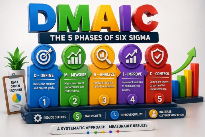
Yes. It is commonly used during the Analyze phase of DMAIC.
Q. What is another name for a Fishbone Diagram?
It is also known as an Ishikawa Diagram or Cause-and-Effect Diagram.
Conclusion
After using Fishbone Diagrams in quality and process improvement work, I have come to see their real value in something quite simple: they make teams slow down and think before they start fixing.
A Fishbone Diagram does not magically reveal the root cause. What it does is give the team a structured way to look beyond the obvious, bring different perspectives together, and identify the causes that deserve further investigation. The most important step comes after the diagram is drawn. Potential causes must be tested against evidence. That is what separates a useful Root Cause Analysis from a brainstorming exercise.
Whether you are investigating a manufacturing defect, customer complaint, process failure, equipment issue, or recurring problem, the same principle applies: don't just fix what happened—understand why it happened and what needs to change to prevent it from happening again.
That, in my experience, is where the Fishbone Diagram earns its place as one of the most practical tools in quality and continuous improvement.
Continue Your Learning Journey
Learning is a continuous process. Explore related topics, practical guides, tools, calculators, templates, and learning resources to expand your knowledge and develop new skills.
Choose a category below to explore practical tutorials, tools, calculators, templates, case studies, and learning resources.
Recommended Learning Resources
Expert-led courses to build practical skills, earn credentials, and advance your career.
Recommended professional books, certification guides, and practical study resources.
Ready-to-use templates, checklists, guides, and workbooks for practical applications.
Interactive calculators for statistics, quality, engineering, analysis, and decision-making.
Interactive Z, t, Chi-Square, and F tables with critical values and distribution curves.
Discover practical tutorials, case studies, and professional resources across Quality, Lean Six Sigma, Project Management, Statistics, AI, and Data Analytics.
Published: August 9, 2026
Last Updated: September 18, 2026

Good succinct summary. I would like to leave feedback for alignment of your text and diagrams. You have several instances where you mention putting the problem as the head of the fish. And several illustrations where the head of the fish is literally a cartoon fish face and no label there, or you see a label at the other end of the diagram. It disrupts the immersion in the tutorial with ‘well that doesn’t look consistent with what I just read.’ If the cartoon fish face or invoking of fish as an animal is felt necessary throughout, perhaps a transparent overlay of the fish face, or a fish outline around the whole thing.