
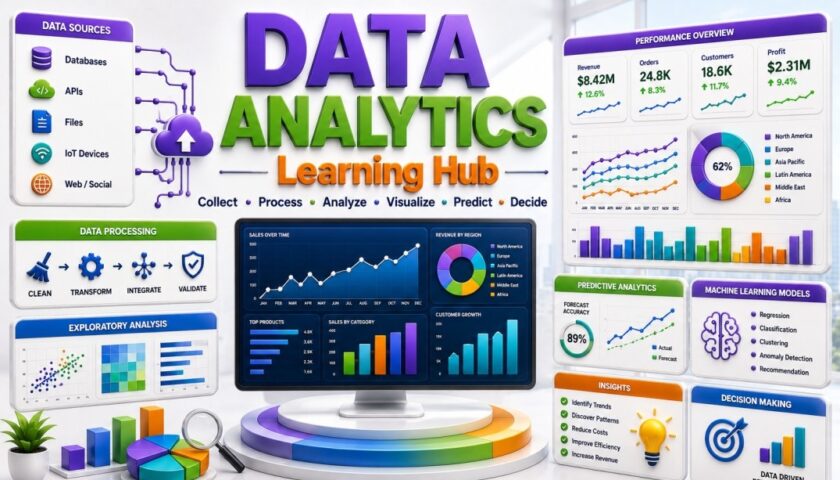
Data Analytics Learning Hub infographic showing data sources, data processing, exploratory analysis, predictive analytics, machine learning models, dashboards, business insights, and data-driven decision making.

๐Ÿ“Š Data Analytics Hub

Learn Data Analytics through practical examples, visual explanations, tools, tutorials, and real-world applications. Whether you are a student, quality professional, engineer, project manager, business analyst, or aspiring data analyst, these resources will help you transform raw data into meaningful insights and better decisions.

Prefer Watching Instead of Reading?
Explore practical tutorials on Lean Manufacturing, Six Sigma, Quality Management, Statistics, Problem Solving, AI, and Data Analytics.
Watch & Subscribe

๐Ÿ“Œ Why Learn Data Analytics?

Data Analytics enables professionals and organizations to understand performance, identify patterns, solve problems, predict outcomes, and make evidence-based decisions. Analytics skills are valuable across quality, manufacturing, healthcare, supply chain, project management, finance, marketing, and business operations. By learning how to collect, clean, analyze, visualize, and interpret data, professionals can communicate insights clearly and support measurable improvement.
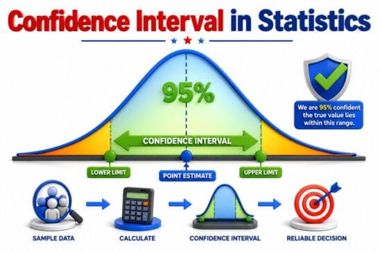

Confidence Interval in Statistics infographic showing 95 percent confidence level, point estimate, lower limit, upper limit, and confidence interval range

Confidence Interval in Statistics with Examples & Calculator
Confidence interval is the range of estimate we are making. Say for e.g we are ...
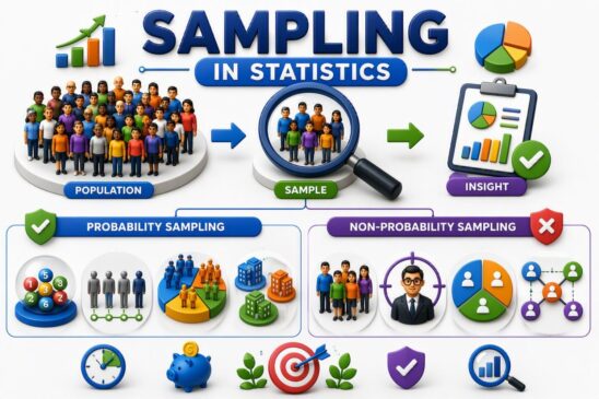
Sampling in Statistics infographic showing population vs sample and probability vs non-probability sampling methods

Sampling in Statistics : Probability vs Non-Probability Sampling
Sampling is a statistical technique that allows statistician, researchers to infer about a population based ...
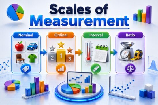
Scales of Measurement in Statistics infographic showing Nominal, Ordinal, Interval and Ratio scales with visual examples

Scales of Measurement (Nominal, Ordinal, Interval & Ratio) in Statistics
Learn how Nominal, Ordinal, Interval, and Ratio scales are used in statistics, research, data analysis, ...
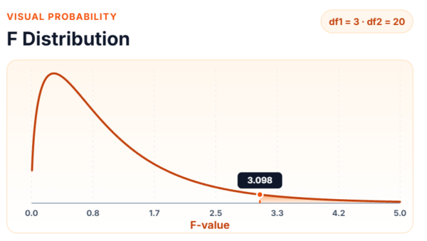
F distribution probability curve showing a right-skewed statistical distribution with an F-value critical point of 3.098 for degrees of freedom df1 = 3 and df2 = 20, commonly used in ANOVA and variance analysis.

F-Table (F-Distribution Critical Values)
F-Table (F-Distribution) Calculator and Critical Values Guide Use the F-Table Calculator below to quickly determine ...
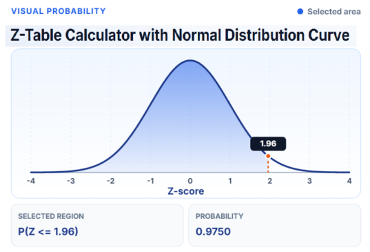
Z-Table calculator with normal distribution curve showing a z-score of 1.96, shaded probability area, and cumulative probability of 0.9750 used for statistical analysis and hypothesis testing.

Z-Table (Standard Normal Distribution Table)
Z-Table (Standard Normal Distribution) Calculator and Z-Score Guide Use the Z-Table Calculator below to quickly ...
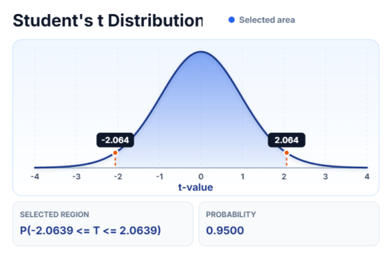
Student's t-distribution curve showing critical t-values of -2.064 and 2.064 with a central probability area of 0.9500, used for hypothesis testing, confidence intervals, and statistical analysis with small sample sizes.

t-Table (Student’s t Distribution Table)
t-Table (Student's t Distribution Table) and find critical Values Guide Use the Student's t-Table Calculator ...
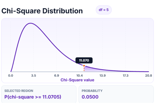
Chi-Square distribution curve showing a critical chi-square value of 11.0705 with 5 degrees of freedom and a right-tail probability of 0.0500, used for hypothesis testing, goodness-of-fit tests, and independence analysis.

Chi-Square Table (ฯ‡ยฒ Distribution)

Chi-Square Table (ฯ‡ยฒ Distribution) Calculator and Critical Values Guide Use the Chi-Square (ฯ‡ยฒ) Calculator below ...
Scroll to Top