Why Decision-Making Feels So Difficult?
Every day, we make decisions—some small, like choosing what to eat, and some critical, like selecting a supplier, choosing a project strategy, or finalizing a product design. While simple choices are easy, complex decisions often leave us confused, overwhelmed, or biased. Most teams don’t struggle because they lack options—they struggle because several options look equally good, each with its own strengths and trade-offs. I’ve seen meetings where discussions went in circles because one person prioritized cost, another focused on performance, and someone else cared most about reliability or manufacturability.
Early in my career, I realized that relying on opinions or intuition rarely leads to the strongest decision. The turning point came when our team started comparing every design concept against the same set of evaluation criteria instead of debating personal preferences. The conversation immediately became more objective, and selecting the right concept was no longer about who had the strongest argument—it was about which solution delivered the greatest overall value. That’s exactly why I rely on a Pugh Matrix (Decision Matrix). It transforms subjective discussions into structured, evidence-based decisions that the entire team can confidently support.
What is a Pugh Matrix (Decision Matrix)?
A Pugh Matrix, also known as a Decision Matrix or Concept Selection Matrix, is a decision-making tool that compares multiple alternatives against the same evaluation criteria. One concept is chosen as the baseline (datum), and every other option is compared against it using simple ratings: “+” (better), “0” (same), and “–” (worse). This approach makes it easy to identify the design concept that delivers the best overall balance of performance, cost, quality, manufacturability, reliability, and other project requirements.
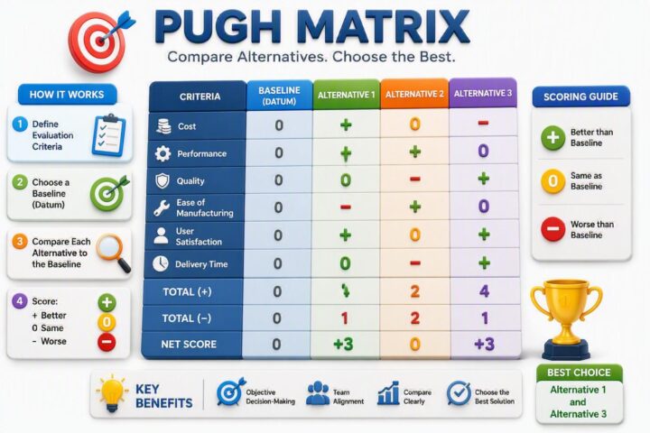
At its core, a Pugh Matrix answers one simple question: Instead of assigning direct scores (like 1 to 10), a Pugh Matrix uses relative comparison:
- +1 → Better than baseline
- 0 → Same as baseline
- -1 → Worse than baseline
This makes the method simple, intuitive, and highly effective for group discussions
“Which option performs better when compared against a baseline (reference option)?”
In my experience, the real value of a Pugh Matrix isn’t the scoring system—it’s the quality of the conversation it creates. It reduces personal bias, encourages fact-based discussions, and helps cross-functional teams reach decisions they can confidently support. Whether you’re designing a new product, improving a process, or solving a complex engineering problem, it provides a simple framework for selecting the most balanced solution. One of the most effective decision-making tools used in product development, process improvement, and operational strategies is the Pugh Decision Matrix.
The Pugh Decision Matrix, also known as the Decision Matrix Method or Pugh Concept Selection, is a comparative analysis tool used to evaluate different alternatives against a reference option (also known as the baseline or datum). It is designed to help decision-makers rank choices based on multiple criteria, reducing bias and improving clarity. One of the most effective tools to facilitate structured decision-making is the Pugh Matrix, also known as the Decision Matrix or Selection Matrix.
When Should You Use a Pugh Matrix?
From my experience, a Pugh Matrix is most useful when every option looks good, but none is an obvious winner. That’s when teams often get stuck in long discussions, with each person defending a different solution based on their own priorities. I’ve seen this many times in product development and quality improvement projects, where choosing the right concept was far more challenging than generating the ideas themselves.
I usually introduce a Pugh Matrix once we’ve shortlisted the most promising concepts. Instead of relying on opinions, we evaluate every alternative against the same criteria—such as performance, cost, quality, manufacturability, reliability, and customer needs. This simple shift changes the conversation from “Which idea do we prefer?“ to “Which option best meets our requirements?” In my experience, it leads to faster decisions, better team alignment, and far more confidence in the final choice.
A Pugh Matrix isn’t limited to engineering design. I’ve successfully used the same approach for process improvement, supplier selection, equipment evaluation, and Lean Six Sigma projects. Whenever you’re comparing multiple alternatives and need an objective, transparent way to select the best overall solution, it’s one of the first tools I recommend.
Understanding Pugh Matrix Scoring
When I first used a Pugh Matrix, I expected to spend time assigning complicated numerical scores. Instead, I discovered that its greatest strength is its simplicity. Every design concept is compared with a baseline (datum) using just three ratings: “+” if it’s better, “0” if it’s about the same, and “–” if it’s worse. This keeps the team focused on meaningful differences instead of debating whether one idea deserves a 7 or an 8.
What I’ve learned over the years is that the scoring symbols aren’t what make the Pugh Matrix valuable—the discussions behind them are. Before scoring begins, the team agrees on the evaluation criteria, such as cost, performance, reliability, manufacturability, or customer needs. Because everyone uses the same criteria, the conversation becomes objective and far less influenced by personal opinions.
One piece of advice I always share is not to chase the highest score. A concept with the most “+” ratings isn’t automatically the best choice if it performs poorly in a critical area like safety or reliability. I use the scores as a guide to understand trade-offs, then combine them with engineering judgment to make the final decision. In my experience, that’s what makes the Pugh Matrix such a practical and trustworthy decision-making tool.
Pugh Matrix Example: Selecting the Best Design Concept
The easiest way to understand a Pugh Matrix is to use it on a real problem. I learned this during a product development project where our team had three strong design concepts. Each looked promising, but for different reasons. Manufacturing preferred the lowest-cost option, quality focused on reliability, while the design team wanted the best performance. Instead of debating which idea felt right, we compared every concept against the same evaluation criteria using a Pugh Matrix.
We selected the existing design as the baseline (datum) and evaluated each alternative for manufacturing cost, durability, ease of assembly, weight, customer appeal, and reliability. Each criterion was scored as “+” (better), “0” (same), or “–” (worse) compared with the baseline. The scoring quickly highlighted the strengths and weaknesses of each concept, making the trade-offs visible to everyone.
One lesson I’ve carried with me ever since is that the highest score doesn’t always mean the best decision. In one project, two concepts finished with similar results, but one significantly improved assembly time—a priority that mattered most to the business. That insight changed our final decision. This is why I see a Pugh Matrix as more than a scoring tool. It creates meaningful discussions, helps teams evaluate trade-offs objectively, and leads to decisions that are easier to justify and support.
Example: Pugh Matrix for Selecting the Best Design Concept
| Evaluation Criteria | Concept A (Baseline) | Concept B | Concept C |
|---|---|---|---|
| Manufacturing Cost | 0 | + | – |
| Product Durability | 0 | + | + |
| Ease of Assembly | 0 | – | + |
| Weight Reduction | 0 | + | 0 |
| Customer Appeal | 0 | 0 | + |
| Reliability | 0 | + | 0 |
| Total (+) | – | 4 | 4 |
| Total (–) | – | 1 | 1 |
| Net Score | – | +3 | +3 |
Although Concept B and Concept C achieve the same net score, the final choice should depend on the project’s priorities—not just the totals. That’s where engineering judgment and business objectives become just as important as the matrix itself.
Pugh Matrix Example (Solved Case Study)
To truly understand how a Pugh Matrix works, let’s walk through a realistic example. Rather than focusing on theory, this case study demonstrates how a team can use a Pugh Matrix to make an informed decision when multiple design concepts appear equally promising.
A few years ago, I was involved in a manufacturing improvement project where the team needed to select the best handle design for a handheld medical device. The existing design was functional, but customer feedback highlighted concerns about comfort and ease of use. After several brainstorming sessions, the engineering team developed three potential design concepts.
- Concept A – Existing Design (Baseline)
- Concept B – Ergonomic Rubber Grip
- Concept C – Lightweight Contoured Handle
Instead of relying on personal preferences, the team decided to evaluate each concept using a Pugh Matrix.
Step 1: Define Evaluation Criteria
The success of a Pugh Matrix is determined long before the scoring begins. It starts with choosing the right evaluation criteria. I’ve seen teams rush into comparing design concepts without first agreeing on what really matters. The result was predictable—manufacturing focused on cost, quality emphasized reliability, design prioritized performance, and everyone reached a different conclusion.
Now, I always spend a few extra minutes defining the criteria before evaluating any concept. That simple step makes every discussion more objective because everyone is measuring the alternatives against the same expectations. The criteria should reflect the project’s goals and customer needs, not individual preferences.
For this case study, we’ll evaluate each design concept using the following criteria:
| Evaluation Criteria | Why It Matters |
|---|---|
| Manufacturing Cost | Controls production costs and profitability |
| Ease of Assembly | Improves production efficiency |
| User Comfort | Enhances customer experience |
| Product Durability | Increases product life and quality |
| Appearance | Influences customer acceptance |
| Reliability | Reduces failures and warranty costs |
Once the evaluation criteria are finalized, the next step is to choose a baseline (datum) that will serve as the reference point for comparing every design concept.
Step 2: Select the Baseline (Datum)
I soon realized that if the baseline isn’t familiar and accepted by the team, the results are much harder to trust.
In most of my projects, I use the current product or existing design as the datum because everyone already understands its strengths and limitations. The baseline isn’t meant to be the perfect solution—it’s simply a common reference against which every new concept is compared. This keeps the evaluation consistent and makes it much easier to identify real improvements.
For this case study, Concept A (Current Design) is selected as the baseline (datum). Concept B and Concept C will be compared against it using the agreed evaluation criteria and assigned a “+” (better), “0” (same), or “–” (worse) rating.
| Design Concept | Description |
|---|---|
| Concept A (Baseline / Datum) | Current Design |
| Concept B | Ergonomic Rubber Grip Design |
| Concept C | Lightweight Contoured Handle Design |
With the baseline in place, we’re ready to compare each concept and identify which one delivers the best overall value.
Step 3: Compare Alternatives Against the Baseline
With the evaluation criteria established and the baseline (datum) selected, the next step is to compare each alternative against the baseline for every criterion. This is the stage where the Pugh Matrix begins to reveal its true value. Instead of arguing about which concept is “best” in general, the team evaluates how each alternative performs relative to a common reference point. This makes the discussion more focused, objective, and easier to manage, especially when multiple stakeholders have different opinions.
One reason I have always appreciated the Pugh Matrix is its simplicity. During many product development and process improvement projects throughout my career, I noticed that teams often struggled when asked to assign absolute scores such as 7 out of 10 or 8 out of 10. Different people interpreted scoring scales differently, creating confusion and inconsistency. The Pugh Matrix eliminates much of that complexity by asking a much simpler question: Is this concept better, the same, or worse than the baseline?
For each evaluation criterion:
- “+” (Positive) = Better than the baseline
- “0” (Neutral) = About the same as the baseline
- “−” (Negative) = Worse than the baseline
I remember working on a manufacturing redesign project where three competing concepts were being considered. Initially, every department championed a different solution. Production favored the easiest design to assemble, quality preferred the most robust option, and marketing leaned toward the most visually appealing concept. Once we began comparing each alternative against the existing product design using a Pugh Matrix, the conversation shifted dramatically. Instead of defending personal preferences, team members focused on factual differences between concepts. That simple change transformed a potentially difficult debate into a productive decision-making process.
For our example, Concept A has been selected as the baseline. We now compare Concepts B and C against it using the agreed-upon criteria.
| Evaluation Criteria | Concept A (Baseline) | Concept B | Concept C |
|---|---|---|---|
| Manufacturing Cost | 0 | – | + |
| Ease of Assembly | 0 | 0 | + |
| User Comfort | 0 | + | + |
| Product Durability | 0 | + | 0 |
| Appearance | 0 | + | + |
| Reliability | 0 | + | 0 |
Let’s examine a few examples from the comparison:
- Manufacturing Cost: Concept B is more expensive to produce than the current design, so it receives a “−”. Concept C reduces production costs, so it receives a “+”.
- User Comfort: Both new concepts provide a better user experience than the existing design, so they each receive a “+”.
- Ease of Assembly: Concept C simplifies the assembly process and receives a “+”, while Concept B offers no significant improvement and receives a “0”.
- Reliability: Concept B improves reliability compared to the baseline, earning a “+”, while Concept C performs similarly to the current design and receives a “0”.
Step 4: Interpret the Results
Begin by counting the number of “+”, “0”, and “–” ratings for each concept. A design with more positive ratings and fewer negatives is usually a strong candidate. However, I always look beyond the totals. A single “–” in a critical area like safety, reliability, or regulatory compliance can outweigh several positive scores in less important criteria.
For our example, Concept B and Concept C achieve similar overall scores, but they excel in different areas. If reducing manufacturing cost and improving reliability are the project’s priorities, Concept B may be the better choice. If ease of assembly and customer appeal are more important, Concept C could provide greater value.
The biggest takeaway I’ve learned is this: use the Pugh Matrix to support your engineering judgment, not replace it. The best decision is the one that aligns with your project’s objectives, customer needs, and business priorities—not simply the concept with the highest score.
Let’s revisit our example.
| Evaluation Criteria | Concept A (Baseline) | Concept B | Concept C |
|---|---|---|---|
| Manufacturing Cost | 0 | – | + |
| Ease of Assembly | 0 | 0 | + |
| User Comfort | 0 | + | + |
| Product Durability | 0 | + | 0 |
| Appearance | 0 | + | + |
| Reliability | 0 | + | 0 |
| Total (+) | – | 4 | 4 |
| Total (-) | – | 1 | 0 |
| Net Score | – | +3 | +4 |
At first glance, Concept C appears to be the best choice because it achieves the highest overall score. However, before making a final decision, the team should examine where those positive scores come from and determine whether they support the project’s priorities.
Concept B Analysis : Concept B performs particularly well in:
- User Comfort
- Product Durability
- Appearance
- Reliability
Its only significant weakness is manufacturing cost. If the organization is developing a premium product where reliability and long-term durability are critical to customer satisfaction, Concept B may still deserve serious consideration despite its higher production cost.
Concept C Analysis : Concept C performs particularly well in:
- Manufacturing Cost
- Ease of Assembly
- User Comfort
- Appearance
It achieves the highest overall score and offers clear operational benefits through lower cost and improved manufacturability. If the project’s objective is to reduce production expenses, simplify assembly, and accelerate product launch, Concept C would likely be the stronger choice.
One of the most valuable lessons I learned during a medical device improvement project was that the “highest-scoring” option is not always the “best” option. In that project, two design concepts finished with almost identical scores. Initially, the team favored the concept with the slightly higher total. However, when we reviewed the individual criteria more carefully, we realized the other concept offered significantly better reliability and reduced potential field failures. Since product reliability was a key customer requirement, we ultimately selected the lower-scoring alternative. The decision proved successful, and the product later achieved excellent customer feedback and reduced warranty issues.
That experience taught me that a Pugh Matrix should be viewed as a conversation starter rather than a scorecard. The numbers help reveal patterns, but the final decision should always consider business objectives, customer expectations, technical risks, and long-term impact.
Final Decision
Based on the results and project goals in this example, Concept C would be selected as the preferred design because it provides the best overall balance of cost, manufacturability, ease of assembly, and user satisfaction. Its advantages align closely with the organization’s objectives, making it the strongest overall choice.
The true power of the Pugh Matrix is not that it tells you what to choose—it helps you understand why one alternative may be better than another. By turning subjective opinions into structured discussions, teams can make decisions with greater confidence, transparency, and stakeholder alignment.
Pugh Matrix Template (Free Download)
📥 Download the free Pugh Matrix Template and make better decisions by comparing multiple design concepts, solutions, or alternatives using a structured, objective evaluation framework. This practical toolkit includes ready-to-use templates, scoring worksheets, weighted decision matrices, checklists, calculators, and implementation forms used in manufacturing, engineering, healthcare, medical devices, Lean Six Sigma, and business improvement projects
Frequently Asked Questions (FAQs)
What is the difference between Pugh Matrix and Decision Matrix?
The Pugh Matrix uses relative scoring against a baseline (+, 0, -), while a decision matrix typically uses weighted numerical scores.
Is Pugh Matrix suitable for beginners?
Yes, it is one of the most beginner-friendly decision tools due to its simple structure.
Can Pugh Matrix be used in daily life?
Absolutely. It can be used for decisions like buying a car, choosing a job, or selecting software.
What is the limitation of Pugh Matrix?
It may oversimplify complex decisions if criteria are not properly defined.
Conclusion
The Pugh Decision Matrix is a powerful decision-making tool used in Six Sigma, Lean Manufacturing, and various industries. It offers a structured, objective, and data-driven approach to selecting the best alternative.
By following a step-by-step approach, businesses can eliminate bias, enhance efficiency, and make informed strategic choices. Despite some limitations, it remains an essential tool for structured decision-making, ensuring improved quality and performance across different domains.
Whether you’re a project manager, engineer, or business leader, mastering the Pugh Matrix can significantly enhance your ability to make smart, data-driven decisions!
As AI and data analytics evolve, the future of decision matrices will become even more sophisticated, ensuring better accuracy and efficiency. By integrating best practices and staying updated on technological advancements, organizations can leverage the Pugh Matrix to drive meaningful, data-driven decisions.
I hope this blog helped in understanding the basic concept in a simplified manner, watch out for I hope this blog helped in understanding the basic concept in a simplified manner, watch out for more such stuff in the future.
📚 Where Should I Go After Learning This Project Management Concept?
Learning one project management concept is only the first step toward becoming an effective project manager. Successful projects require understanding how different project management tools, techniques, and frameworks work together throughout the project lifecycle.
Continue your learning journey with these practical guides on Digital E-Learning to strengthen your knowledge of Project Management, PMP®, Agile, Planning, Scheduling, Risk Management, and Team Leadership.
- Pugh Matrix or Decision Matrix Method
- What Is Kanban?
- Network Diagram in Project Management
- RACI matrix
- SWOT Analysis With Examples & Case Study?
- Mission Vision Goals and Objectives
- BCG (Boston Consulting Group) Matrix
About the Author
Aman is the Founder of Digital E-Learning and a Quality & Continuous Improvement professional with more than 25 years of experience across the Automotive, Medical Device, Manufacturing, and Consulting industries. Throughout his career, he has led and contributed to numerous initiatives in Lean Six Sigma, Quality Engineering, Risk Management, Design Assurance, Process Improvement, Problem Solving, and Operational Excellence, helping organizations enhance quality, improve efficiency, and deliver greater customer value.
Drawing on extensive real-world industry experience, Aman focuses on simplifying complex concepts into practical, easy-to-understand learning resources. His content combines proven methodologies, industry best practices, and hands-on examples to help students, engineers, quality professionals, and business leaders apply these concepts effectively in their day-to-day work.
In addition to his professional experience, Aman is the creator of the Digital E-Learning YouTube channel, a trusted learning platform followed by over 125,000 subscribers worldwide. Through his articles and videos, he shares practical knowledge in Lean Manufacturing, Six Sigma, Quality Management, Statistics, Microsoft Excel, Project Management, and Continuous Improvement.
Published: October 3, 2024
Last Updated: July 19, 2026