Scales of Measurement (Levels of Measurement): How to Choose the Right Scale (Nominal, Ordinal, Interval & Ratio)
Before analyzing data, creating charts, calculating averages, or performing statistical tests, it is important to understand what type of data you are working with. Two values may both appear as numbers, but not all numbers carry the same meaning. A customer satisfaction rating, a temperature reading, and a product serial number may look similar, yet each represents a different type of measurement and must be interpreted differently.
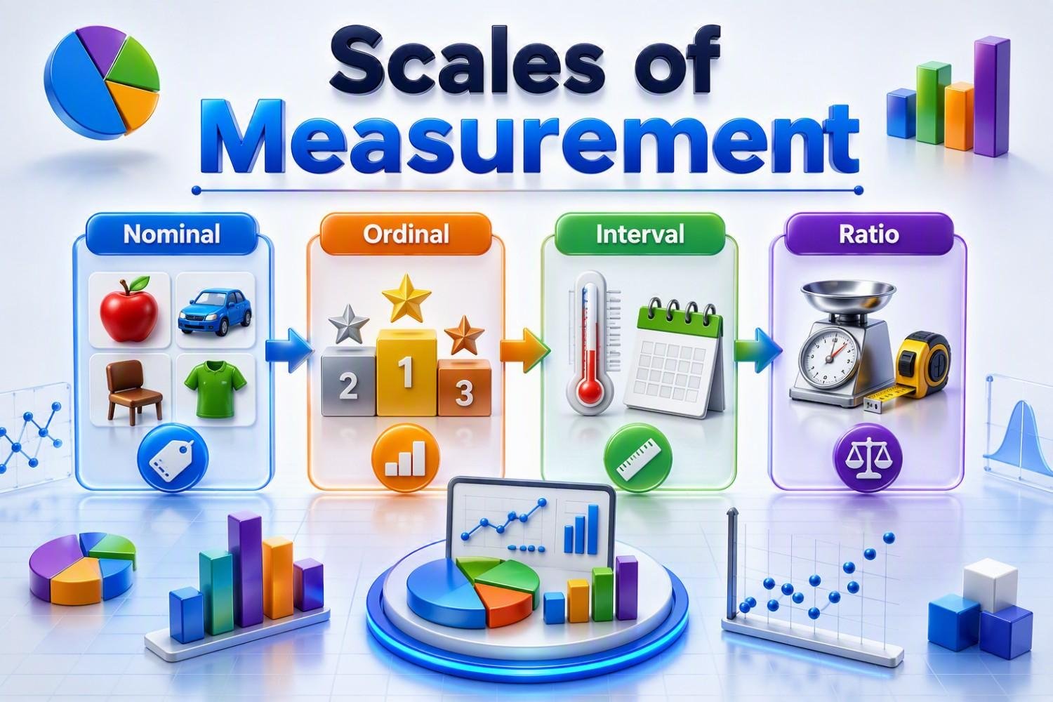
The Scales of Measurement provide a framework for classifying data into four categories: Nominal, Ordinal, Interval, and Ratio. These scales determine how data can be organized, analyzed, and interpreted, and they influence which statistical methods can be used accurately. Choosing the correct scale is one of the most fundamental steps in statistics, quality engineering, Six Sigma, research, and data analytics.
Understanding these measurement scales helps ensure that data is analyzed correctly, conclusions are reliable, and decisions are based on meaningful insights rather than misleading calculations.
What are Scales of Measurement in Statistics?
Every dataset has a story to tell, but the quality of that story depends on how the data is measured. Before creating charts, calculating averages, or applying statistical tests, the first question I ask is: “What type of data am I working with?”
When I started learning statistics, I made the common mistake of treating every number the same. A rating of 1 to 5, a product weight, and a serial number all looked like numbers, but they did not carry the same meaning. Working with real-world quality and manufacturing data helped me understand that the way data is measured determines how it should be analyzed.
Scales of measurement provide the framework for classifying data into four categories: Nominal, Ordinal, Interval, and Ratio. Each scale tells us what information the data contains and what statistical methods are appropriate.
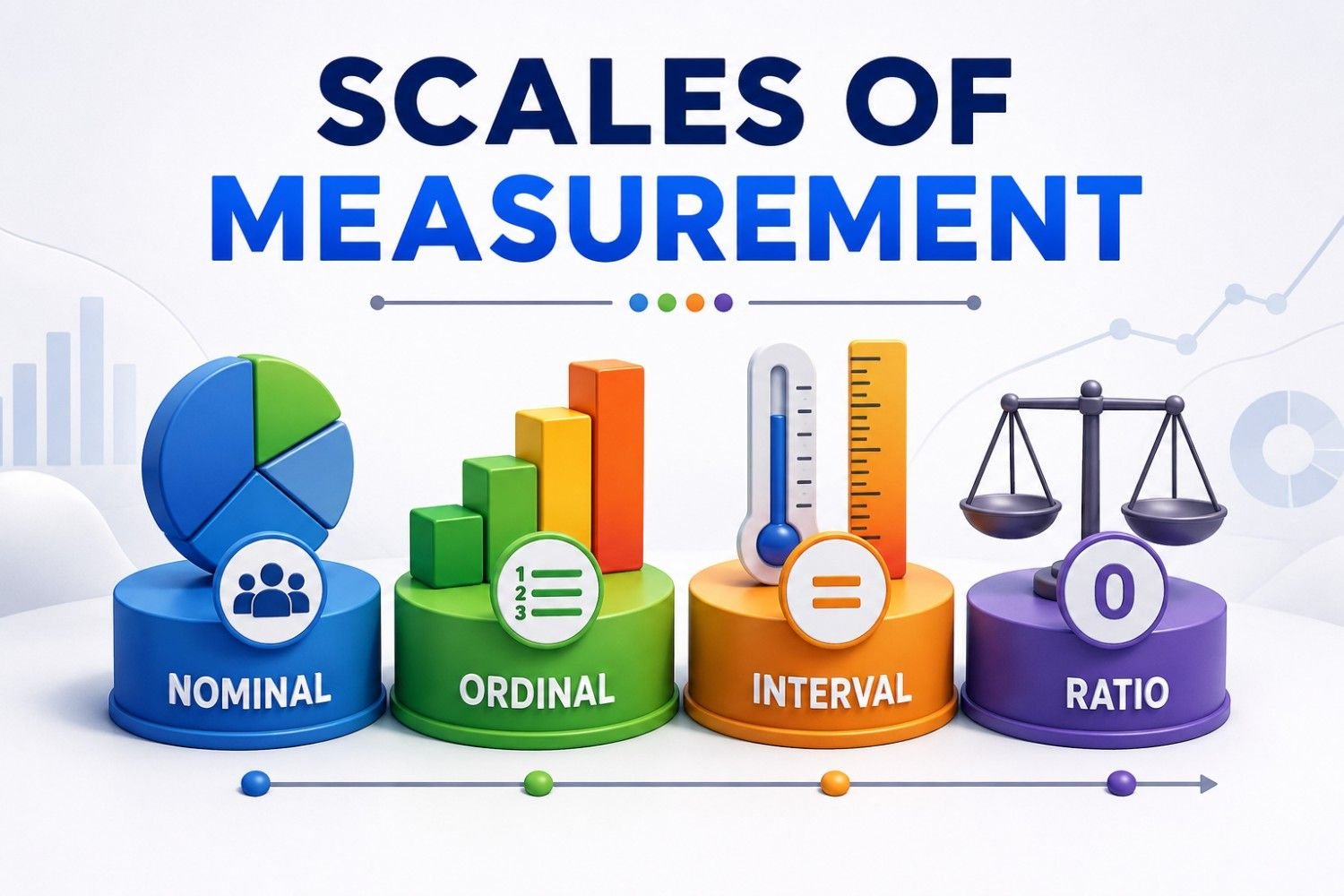
For example, a defect type, product category, or department name is Nominal data because it only identifies groups. A risk level or customer satisfaction rating is Ordinal data because it shows an order, but the difference between levels may not be equal. Interval data, such as temperature in Celsius, has equal differences between values but no true zero point. Ratio data, such as weight, cycle time, cost, or production quantity, provides the highest level of measurement because it includes a meaningful zero and allows full mathematical comparisons.
In my experience, many analysis mistakes happen before any formula is applied. People often choose a chart, calculate an average, or run a statistical test without first understanding the measurement scale. A wrong assumption at this stage can lead to incorrect conclusions.
Understanding scales of measurement makes statistics more practical. Whether you are analyzing manufacturing defects, customer feedback, healthcare data, or business performance, knowing the type of data you have is the first step toward selecting the right analytical approach. Scales of measurement may seem like a basic statistics concept, but they are the foundation that helps turn raw data into reliable decisions.
Types of Scales of Measurement
One lesson I learned while working with real-world engineering and quality data is that not all numbers mean the same thing. A defect code, customer rating, machine temperature, and product weight may all appear as data points, but each one tells a different story. Understanding that difference is where scales of measurement become important.
In statistics, data is classified into four main measurement scales: Nominal, Ordinal, Interval, and Ratio. These scales define how much information the data provides and what type of analysis can be performed. Choosing the correct scale helps avoid common mistakes, such as using the wrong chart, calculating an inappropriate average, or applying an unsuitable statistical test.
In my quality engineering experience, I frequently work with Nominal data, such as defect types, product categories, or machine IDs. This data is used only for classification. For example, grouping defects as scratches, cracks, or dimensional issues helps identify patterns, but these categories cannot be ranked as higher or lower.
Ordinal data adds an order or ranking. Examples include customer satisfaction levels, risk ratings, or severity categories. While we can arrange them from low to high, we cannot assume that the difference between each level is equal.
Interval data goes a step further by providing equal differences between values. Temperature in Celsius is a common example. The difference between 10°C and 20°C is the same as the difference between 20°C and 30°C, but zero does not indicate the complete absence of temperature.
Ratio data provides the most complete measurement because it has a true zero point. Measurements such as weight, length, cycle time, cost, and production quantity allow meaningful comparisons, including statements like “twice as much” or “half the value.”
The biggest takeaway from my experience is simple: before analyzing data, understand what the data represents. Many incorrect conclusions happen not because the calculation is wrong, but because the wrong type of data analysis was chosen. Identifying the measurement scale is the first step toward making accurate decisions from data.
🎓 Top-Rated Courses & Certifications
Try changing your filters or searching for another course.
Nominal vs. Ordinal vs. Interval vs. Ratio: Key Differences
After understanding the four measurement scales, the next important question is: how do they differ in practical data analysis? In my experience working with quality and process data, the biggest challenge is not identifying the names of these scales—it is knowing what analysis each scale actually supports.
The key difference between these scales is the amount of information they provide. Nominal data provides the least information because it only separates data into groups. Ordinal data adds ranking, but the difference between ranks cannot always be measured. Interval data allows meaningful comparison of differences between values, while Ratio data provides the highest level of flexibility because it supports both differences and true comparisons.
A simple way I use to remember the difference is:
- Nominal: Can I only name or categorize it?
- Ordinal: Can I arrange it in order?
- Interval: Can I compare the difference between values?
- Ratio: Can I compare values using a meaningful zero?
| Feature | Nominal | Ordinal | Interval | Ratio |
|---|---|---|---|---|
| Identifies categories | ✓ | ✓ | ✓ | ✓ |
| Shows order or ranking | ✕ | ✓ | ✓ | ✓ |
| Equal differences between values | ✕ | ✕ | ✓ | ✓ |
| Has a true zero point | ✕ | ✕ | ✕ | ✓ |
| Supports advanced statistical analysis | Limited | Moderate | Higher | Highest |
One practical mistake I have seen often is assuming that all numerical-looking data can be analyzed the same way. For example, a customer rating of 1 to 5 may look like a number, but treating it exactly like a measurement such as weight or cycle time can lead to incorrect conclusions.
The right measurement scale helps determine which summaries, charts, and statistical methods are appropriate. Before performing any analysis, I always start by understanding the data type first—because the quality of the conclusion depends on the quality of that decision.

Lean Six Sigma • Six Sigma • Statistics • Project Management • Artificial Intelligence (AI) • Operations Management • Quality Management
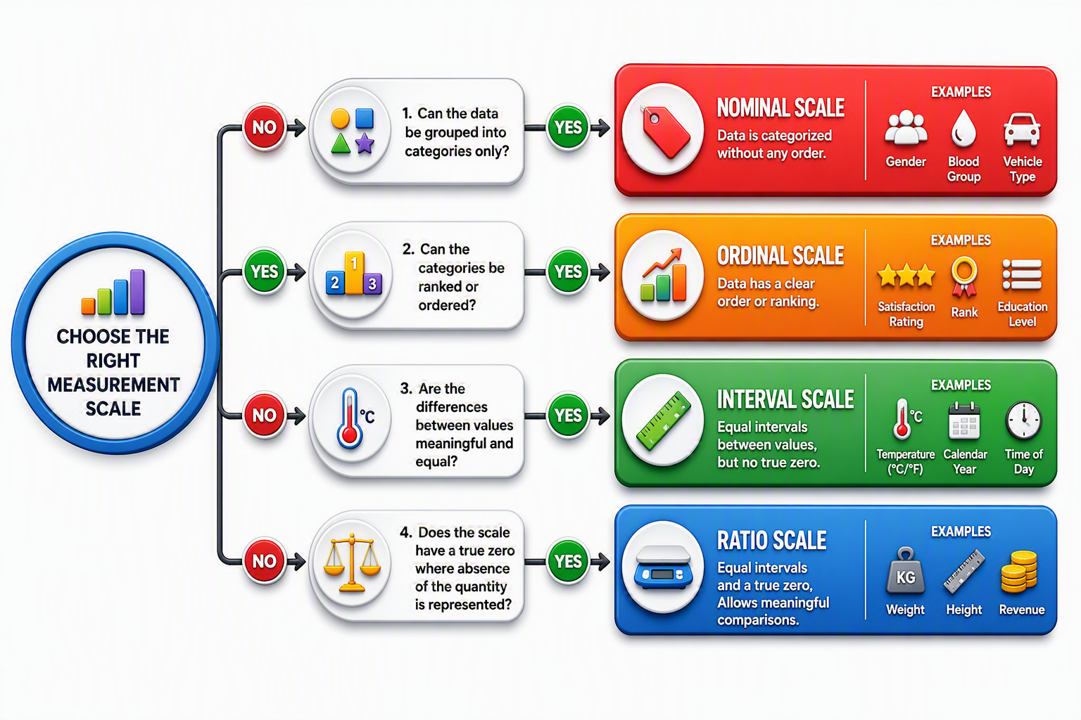
Simple Decision Tree for Choosing the Right Measurement Scale
When I work with a new dataset, I don’t start with formulas or software—I start by asking a few simple questions about the data itself. If the data only places items into groups, it’s Nominal. If those groups can be ranked from low to high, it’s Ordinal. If the values have equal gaps between them, it’s Interval. Finally, if the data also has a meaningful zero point, it’s Ratio. Following this simple decision tree helps ensure the right statistical methods are used from the beginning and prevents costly mistakes later in the analysis.
How to Identify the Correct Measurement Scale ?
One of the most useful habits I developed while working with quality improvement and manufacturing data is to identify the measurement scale before doing any analysis. Early in my career, I occasionally focused on calculations first and only later realized that the data itself wasn’t suitable for the statistical method I had chosen. Over time, I learned that the simplest approach is to stop and ask a few practical questions. Is the data simply labeling or categorizing something, such as a defect type or department name? If so, it is Nominal. Can the data be placed in a meaningful order, such as customer satisfaction ratings or risk levels? Then it is Ordinal. Do the values have equal spacing between them, like temperature readings? That indicates an Interval scale. Finally, if the data has a true zero and allows meaningful comparisons such as “twice as much” or “half as much,” it belongs to the Ratio scale, which includes measurements like weight, cycle time, revenue, and distance.
In my experience, correctly identifying the measurement scale often prevents more mistakes than any advanced statistical software ever could. I’ve seen teams create impressive charts and reports only to discover later that they were analyzing ordinal survey scores as if they were ratio measurements. By spending a minute understanding what the data actually represents, you can choose the right charts, averages, and statistical tests with confidence. It’s a small step that consistently leads to more accurate insights and better decision-making.
Why Scales of Measurement are Important
While working with quality and manufacturing data is that good analysis starts before any formula or statistical tool is used. Early in my career, I focused on learning charts, calculations, and statistical methods, but I later realized that the first step is understanding what the data actually represents.
Scales of measurement are important because they define how data can be analyzed. A number in a dataset does not always mean it can be averaged, compared, or used in the same way. A machine ID, customer rating, temperature value, and product weight may all appear as data points, but each carries a different level of information.
In my experience, many analysis errors happen because the data type is misunderstood. For example, treating customer rankings like exact measurements or analyzing defect categories with numerical calculations can create misleading results. The problem is not the calculation—the problem is choosing the wrong approach for the data. Understanding measurement scales helps you select the right chart, summary method, and statistical technique. In quality improvement, this directly impacts root cause analysis and process decisions. In business analytics, it affects how performance data and customer feedback are interpreted.
A simple question I always ask before analyzing any dataset is: “What does this data truly tell me?” This small step prevents many mistakes and leads to more reliable insights.
Scales of measurement may look like a basic statistics concept, but they are the foundation of accurate data analysis. When you understand your data first, the statistics that follow become much more meaningful.
Common Mistakes When Choosing a Measurement Scale
A common mistake is assuming that every number represents a true measurement. For example, a product code, employee ID, or serial number may contain digits, but they are only labels. Similarly, customer ratings or satisfaction levels may show a ranking, but the difference between each level is not always equal.
I have seen this happen while reviewing quality metrics and improvement data. It is easy to calculate an average or create a chart because most software tools allow it, but the result may not always represent meaningful information. A mathematically correct answer can still lead to the wrong conclusion if the data type is misunderstood.
Another mistake is selecting a statistical method first and checking the measurement scale later. In reality, the scale should guide the choice of charts, summary statistics, and analysis techniques. The data determines the method—not the other way around.
A simple question I use before analyzing any dataset is: “What does this data actually represent?” Is it a category, a ranking, a measurement with equal intervals, or a value with a true zero? Taking a moment to answer this can prevent hours of rework. From my experience, reliable analysis does not begin with complex statistics. It begins with correctly understanding the data you have.
📚 Recommended Books for Professionals
Try removing one or more filters.
Real-World Examples of Scales of Measurement
I have found that scales of measurement are much easier to understand when you connect them to real-world data instead of memorizing definitions. In my work with quality and manufacturing data, I usually start with one simple question: “What information does this data actually provide?”
For example, defect categories such as scratches, cracks, missing parts, or machine IDs are Nominal data because they help us classify and count information. They tell us what type of issue exists, but they cannot be ranked or averaged. Customer feedback ratings, risk levels, and severity classifications are common examples of Ordinal data. They provide an order, such as low to high or poor to excellent, but the difference between each level is not necessarily equal.
In process monitoring, I frequently work with Interval data, such as temperature measurements in Celsius. The difference between readings is meaningful, but zero does not represent the complete absence of temperature.
Ratio data is widely used in engineering and production because it allows true comparisons. Measurements like cycle time, product weight, output quantity, cost, and length have a meaningful zero point, making comparisons such as “twice as much” or “50% higher” valid.
One thing I have learned from real projects is that a single report can contain all four measurement scales at the same time. A quality dashboard may include defect types, customer ratings, process temperatures, and production output—all requiring different analysis approaches.
Before creating charts or applying statistical methods, I always check what the data represents first. This simple habit helps avoid incorrect analysis and ensures that the conclusions are based on meaningful information rather than just numbers in a spreadsheet.
Lean Six Sigma • Six Sigma • Statistics • Project Management • Artificial Intelligence (AI) • Operations Management • Quality Management
Cheat Sheet: Scales of Measurement at a Glance
📥 Download the Scales of Measurement Cheat Sheet and quickly identify whether your data is Nominal, Ordinal, Interval, or Ratio. This practical reference guide helps students, engineers, quality professionals, and Lean Six Sigma practitioners choose the correct measurement scale, select appropriate statistical methods, avoid common analysis mistakes, and make more reliable data-driven decisions.
Continue Your Learning Journey
Learning is a continuous process. Explore related topics, practical guides, tools, calculators, templates, and learning resources to expand your knowledge and develop new skills.
Choose a category below to explore practical tutorials, tools, calculators, templates, case studies, and learning resources.
Recommended Learning Resources
Expert-led courses to build practical skills, earn credentials, and advance your career.
Recommended professional books, certification guides, and practical study resources.
Ready-to-use templates, checklists, guides, and workbooks for practical applications.
Interactive calculators for statistics, quality, engineering, analysis, and decision-making.
Interactive Z, t, Chi-Square, and F tables with critical values and distribution curves.
Discover practical tutorials, case studies, and professional resources across Quality, Lean Six Sigma, Project Management, Statistics, AI, and Data Analytics.
Published: June 29, 2023
Last Updated: September 18, 2026